
Whether or not you really do taste the difference between Pepsi and Coca-Cola, there’s a lot more than taste that sets these two beverage brands apart.
It’s the tale of two brands that don’t compete just on a product level but on brand identity—and that’s what we’ll delve into today.
A great brand with a strong identity stands out on the shelves (or web shop) like a lighthouse on a cloudy day. Meanwhile weak brand identities are only noticed when they throw themselves in front of consumers (and even then the impact might be limited).
It’s clear which one you want to be, but how do you create an “identity” for a brand?
For a second, let go of the thought that you’re doing this for a business. Imagine branding a person or shaping someone’s identity, Sims-style. What do they wear? What slang do they use?
Suddenly, brand identity entails all the elements of a brand that distinguish it in the consumers’ minds, such as color scheme, design, logo, tagline and more. With the right combination of those elements, not only will you differentiate your brand from competitors, but you’ll also create a sense of familiarity and trust with your audience.
A brand identity will generally consist of the following elements:
- A clear vision and mission that align with your customer’s expectations
- A unique logo that communicates your brand’s personality
- A consistent color palette that resonates with your target audience
- Typography and font choices that complement your brand’s message
- Distinctive imagery that is associated with your brand
- A compelling tagline that encapsulates your brand’s mission
- An authentic tone of voice that reflects your brand values
What is brand identity?
Brand identity is how your brand presents itself to the world—it’s the combination of visual elements, messaging, and personality that makes you instantly recognizable.
Think of it as your brand’s DNA, shaping how people see and experience you.
A strong brand identity goes beyond just a logo or color palette. It’s about creating a consistent and memorable impression across every touchpoint, from your website and social media to your packaging and customer interactions.
When done well, brand identity builds trust, reinforces your positioning, and helps you stand out in a crowded market.
TL;DR
Here’s a summary of our top brand identity examples:
| Brand | Brand identity | Brand Tone of Voice (ToV) | Colors and visual features | Target audience |
| Apple | Revolutionary, premium, minimalist | Empowering, individualistic, forward-thinking | Monochromatic apple logo, sleek aesthetics | Tech-savvy consumers, status-conscious individuals |
| LEGO | Fun, imaginative, creative | Playful, innovative, inclusive | Bold, primary colors, playful imagery | Wide demographic – children to adults |
| Nike | Ambitious, inspiring, athletic | Motivating, aspirational, perseverant | Sleek, modern design with heavy emphasis on athletics | Sports enthusiasts, active lifestyle individuals |
| Coca-Cola | Consistent, positive, universal | Happy, sharing, universally connecting | Red-and-white color scheme, classic bottle design | Global audience, all age groups |
| MOMA | Healthy, convenient, innovative | Conversational, enthusiastic, empowering | Fresh and vibrant, with clean lines and popping colors | Health-conscious consumers, busy individuals seeking quick yet nutritious meals |
| Starbucks | Comforting, consistent | Warm, welcoming, community-oriented | Warm color palette, consistent café design | Coffee enthusiasts, people seeking a ‘third place’ outside of home and work |
| McDonald’s | Simple, fun, consistent | Cheerful, approachable, universally enjoyable | Vibrant red and yellow color scheme, iconic golden arches | Global audience, fast-food consumers |
| Oddbox | Sustainable, quirky, community-focused | Ethical, playful, fresh | Vibrant, playful color palette, unique typography | Environmentally conscious consumers, those seeking fresh produce |
| Duvel Beer | Historic, playful, dedicated | Bold, traditional, high-quality | Muted color palette, consistent bottle labeling | Beer enthusiasts, people appreciating tradition and quality |
| MailChimp | Friendly, accessible, fun | Humorous, conversational, helpful | Bright, bold colors, unique, playful fonts | Businesses needing email marketing solutions |
| Thursday | Bold, spontaneous, direct | Engaging, straightforward, refreshing | Vibrant purple color, calendar page logo | Singles seeking meaningful interactions, online dating audience |
| Patagonia | Sustainable, activist, high-quality | Responsible, outdoor-oriented, inspiring | Minimalist logo, earthy tones | Outdoor enthusiasts, environmentally conscious consumers |
| The Vegan Society | Reliable, inclusive, informative | Advocacy-focused, supportive, authoritative | Green and white theme, globally recognized Vegan Trademark | Vegans, those interested in animal rights and vegan lifestyle |
| IKEA | Affordable, functional, for everyone | Friendly and simple, welcoming and relatable. | The blue and yellow logo harks back to its Swedish roots; visuals are clean and minimalistic. | Cost-conscious consumers who value good design and sustainability. |
| Glossier | Minimalist, community-driven, and authentic | Friendly, conversational, and inclusive | Soft pink, white, and dewy, clean aesthetics | Beauty enthusiasts who value simplicity and authenticity |
| Notion | Sleek, flexible, and highly functional | Clear, professional, and adaptable | Monochrome palette, minimalist UI, custom icons | Productivity-focused individuals, teams, and startups |
| Monzo | Transparent, disruptive, and customer-first | Informal, straightforward, and engaging | Bright coral debit card, modern and approachable UI | Millennials and Gen Z looking for an alternative to traditional banking |
| Airbnb | Warm, inclusive, and experience-focused | Welcoming, human, and inspiring | Soft, warm tones, clean layouts, and lifestyle imagery | Travelers seeking unique, local, and community-driven experiences |
| Ben & Jerry’s | Playful, socially conscious, and bold | Fun, witty, and activist-driven | Bright, hand-drawn packaging, bold typography | Ethical consumers and ice cream lovers who support social causes |
| Spotify | Personalized, dynamic, and youth-driven | Energetic, modern, and engaging | Vibrant gradients, bold black and green branding | Music lovers who value curation and personalization |
| Oatly | Bold, rebellious, and purpose-led | Witty, irreverent, and activist-driven | Hand-drawn typography, muted pastels, and bold black text | Health-conscious and environmentally aware consumers |
Want to know exactly how your brand would fit into this list? Get started with our brand perception template.

Top 20 brand identity examples
1. Apple
Design is not just what it looks like and feels like. Design is how it works.
Steve Jobs, Co-Founder of Apple
Do we even need to explain how Apple’s identity works? The $3 trillion brand’s identity is built on innovation, simplicity and premium quality—characteristics it’s been famed for for decades.
Apple’s minimalist brand design, from its monochromatic Apple logo to the sleek aesthetics of its products and simple product names, reflects a commitment to simplicity and user-friendly design.
They make their identity an experience, whether you open the box of your new iPhone (why is that so satisfying?) or watch their revolutionary product launches. You see it in their unique store design resembling a modern tech haven, and the clean, aspirational feel of their advertising all contribute to the ‘premium’ perception.
Apple’s brand messaging also revolves around a simple yet powerful promise: empowering individuals through technology. Just think of their iconic tagline, “Think Different” (and maybe apply it to your own brand).
Key takeaway: well-executed simplicity is strong
Apple’s brand identity masterfully illustrates how companies can differentiate themselves in a crowded market. Not by adding whistles and bells but by taking them away. By prioritizing product design, focusing on user experience and consistently pushing boundaries, Apple has cultivated a loyal customer base that eagerly anticipates its next innovation.
2. LEGO
Only the best is good enough.
Ole Kirk Christiansen, Founder of LEGO
LEGO’s brand identity is a testament to the power of imagination. The brand revolves around the joy of building and the creativity it nurtures. The simple, bold LEGO logo, vivid primary colors, and playful imagery all scream a sense of fun and innovation. LEGO has managed to appeal to a wide demographic – from children exploring their creative sides to adults indulging in nostalgic builds.
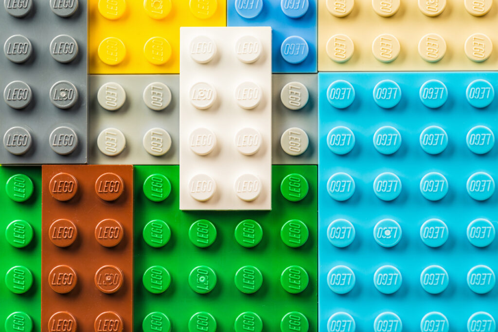
Key takeaway: clever designs can appeal to vastly different segments
LEGO demonstrates that a strong brand identity can transcend age demographics by tapping into universal human experiences like creativity and play. A well-executed brand identity, as seen with LEGO, can also create strong emotional connections with younger generations of consumers (like Gen Z), all the way to their adulthood.
3. Nike
If you have a body, you are an athlete.
Bill Bowerman, Co-Founder of Nike
Nike’s identity goes beyond their iconic swoosh logo. It even goes beyond whether or not people pronounce their name correctly—proving there’s a lot more to brand identity than ‘branding’.
Their vision, “To bring inspiration and innovation to every athlete in the world,” combined with a compelling tagline, “Just Do It,” has defined the brand’s identity around perseverance, ambition, and the spirit of athleticism.
From their TV ads featuring inspiring stories of athletes to their sleek, modern product designs and all the apps they provide consumers with, every element of Nike’s brand reinforces this vision.
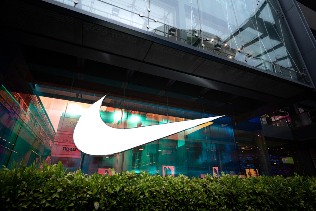
Key takeaway: focus on what your customer wants to achieve
Aligning your brand’s vision with your target audience’s aspirations, as Nike does, can foster a deeper emotional connection with target customers. Moreover, Nike shows that a strong tagline can also be a powerful tool in establishing a brand identity. Even if everybody pronounces your name differently.
4. Coca-Cola
A brand is a promise. A good brand is a promise kept.
Muhtar Kent, Former CEO of The Coca-Cola Company
Coca-Cola’s identity is a masterclass in consistency and positivity. Centered around happiness, sharing, and universal connectivity, Coca-Cola’s brand has a timeless appeal.
The red-and-white logo and the curvy typography are instantly recognizable. Even if the typeface spells out your own name rather than Coca-Cola, you know that it’s their branding. The brand has maintained its classic bottle design over decades, creating a strong visual identity.
Their ad campaigns often showcase heartwarming moments of connection, further strengthening their position as a brand that brings people together.
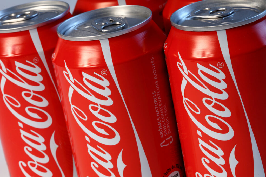
Key takeaway: consistency is king
Coca-Cola exemplifies the power of consistency in branding elements and messaging. Over time, such consistency can really engrain your brand in popular culture and consumer minds, creating a legacy that extends beyond the product itself. After all, most people ask for Coke, not Pepsi.
5. MOMA
MOMA brilliantly reflects a brand identity that communicates health, convenience, and innovation. Their brand aesthetic is accessible: it’s fresh and vibrant, with a focus on clean lines and bright, popping colors.
This design choice subtly reflects the brand’s commitment to providing quick, healthy breakfast options without sacrificing taste or quality.
While we’ve done sporadic topline brand awareness surveys in the past, this is a much more insightful, detailed way of understanding the impact of our marketing over time. And it’s been brilliant to know that we’ve got a dedicated team at Attest if we need any help or advice.
Natasha Thompson, Marketing Director, MOMA Foods
The brand’s key differentiator, the ‘craft oat’ concept, is conveyed through carefully designed packaging and branding elements that highlight the quality of the ingredients and the craft behind their products.
Their copy is creative but conversational: “No one gets left out.” This tone strengthens their position as a playful, innovative brand in the healthy breakfast space.
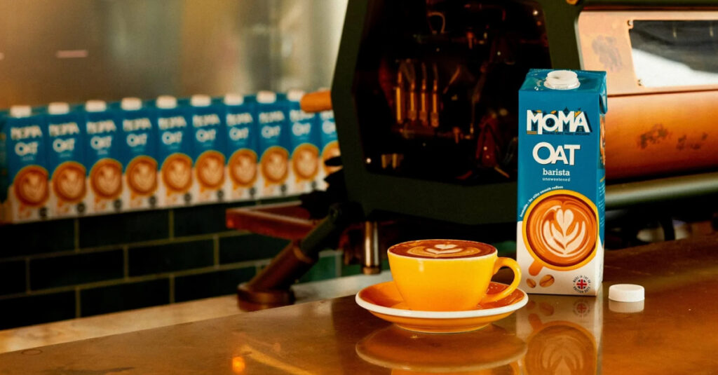
Key takeaway: focus on your USP
By developing a unique brand proposition (‘craft oat’), maintaining a vibrant aesthetic, and consistently conveying its USPs, MOMA has managed to carve out a unique space in the breakfast market. This strategy can inspire brands aiming to set themselves apart by turning common perceptions (like oats being boring) on their head.
6. Starbucks
If people believe they share values with a company, they will stay loyal to the brand.
Howard Schultz, Former CEO of Starbucks
Starbucks has cultivated a brand identity that’s not just about coffee but about the complete coffee experience. It’s all about treating yourself. Starbucks is the place to go to before work, between meetings, and after Pilates.
Their ‘third place’ concept—a relaxing and comfortable space between work and home—is reflected in their welcoming cafe design and warm color palette. Every Starbucks cafe around the globe retains a consistent look and feel, offering a familiar comfort to their customers.
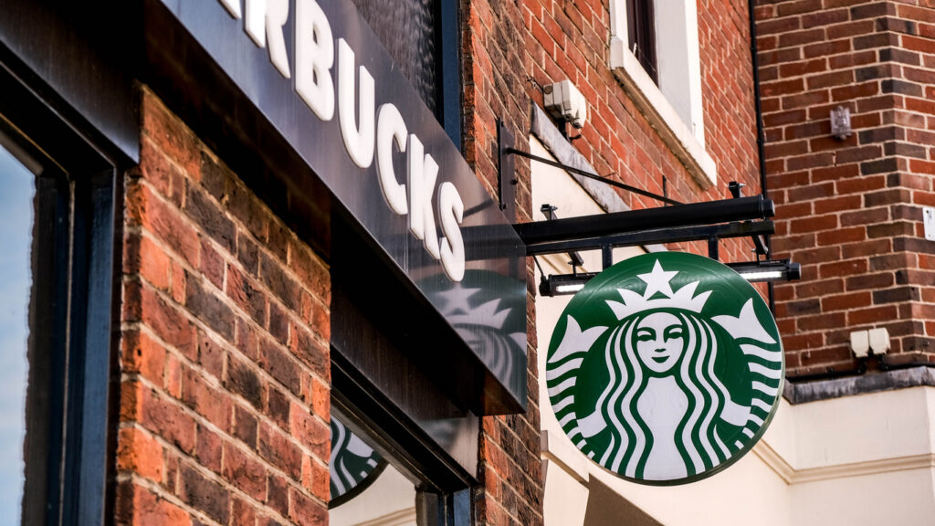
Key takeaway: make even your chairs match your identity
Starbucks teaches us that a strong brand identity can be used to create a unique customer experience that resonates on a global level. Branding can be a tool to not just showcase your products but also to create a unique atmosphere that customers associate with your brand.
If you have physical stores or offices, make sure they match your identity as well.
7. McDonald’s
Our brand is the most precious thing we have.
Ray Kroc, Founder of McDonald’s
The McDonald’s brand is a study of the power of simple, fun, consistent branding. The golden arches are among the most recognized logos globally. The “I’m Lovin’ It” jingle, and the vibrant red and yellow brand colors, all work together to create a playful and approachable brand personality.
McDonald’s marketing efforts and campaigns consistently emphasize speed, convenience and a universally enjoyable fast-food experience. Like Coca-Cola, they’ve remained consistent over decades and are now reaping the benefits.
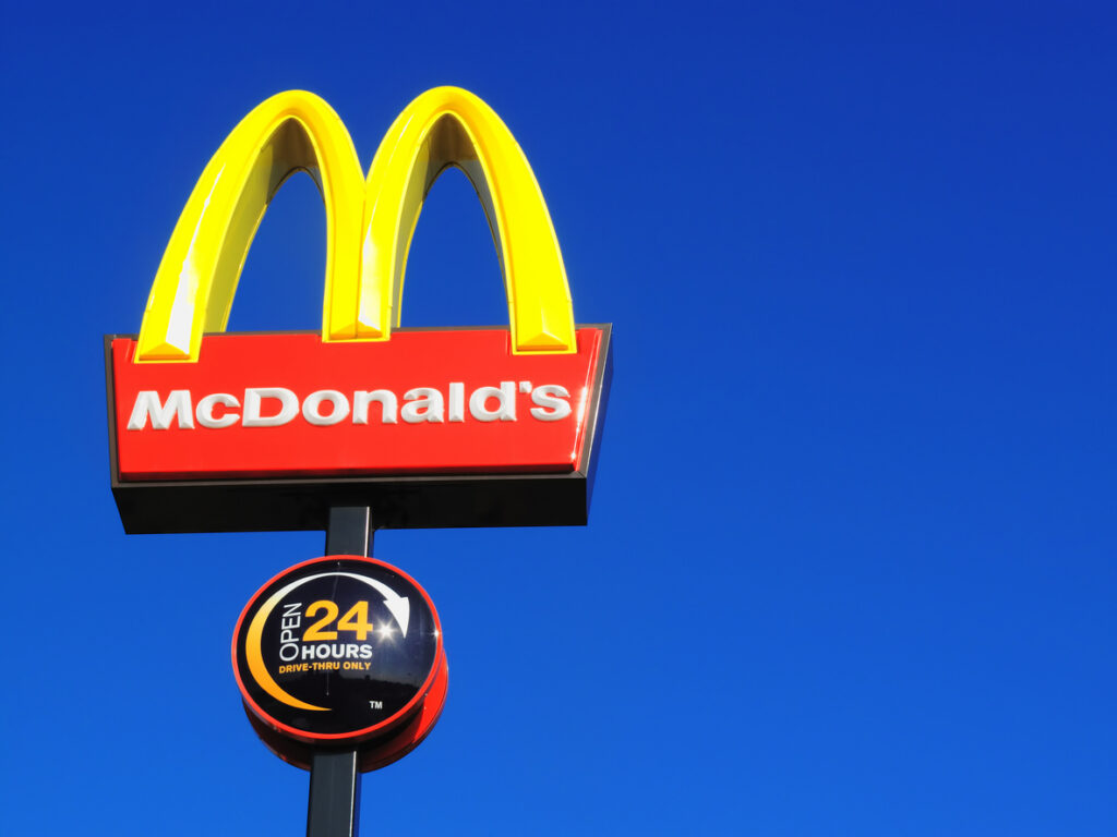
Key takeaway: a strong logo goes a long way
If you think that one element is more important than the other, think again. They all deserve your attention and love. Even something as ‘small’ as a logo.
McDonald’s showcases the power of a memorable logo design and how it can create an instantly recognizable identity that transcends cultures and geographic boundaries.
8. Oddbox
Oddbox has carved out a distinctive brand identity that is sustainable, quirky and community-focused. They sell wonky fruit, so they made their brand identity match.
Their vibrant, playful color palette and unique typography capture attention, while the box in their logo subtly nods to their service—delivering boxes of ‘odd’ but perfectly good fruits and vegetables.
Oddbox’s strong environmental ethics and mission to combat food waste are front and center in their messaging, creating a brand personality that resonates with environmentally conscious consumers.
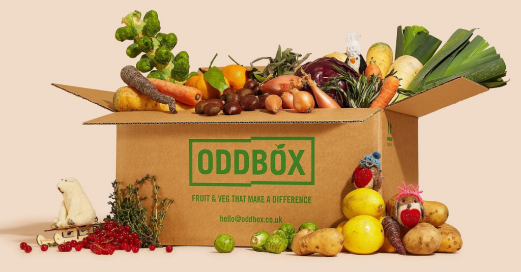
Key takeaway: extend your mission to your branding elements
Oddbox is a great example of how a brand can intertwine its operations, ethics and branding. In doing so, they’ve crafted a cohesive brand identity, that is not only distinctive but also makes consumers feel good about their purchases.
9. MailChimp
In the dry world of email marketing, MailChimp is a brand identity example that is known across all levels of marketers. It has established a brand identity that is friendly, accessible and fun. The name is easy to remember and, for once, tells you what you’re dealing with (more or less).
Their quirky, smiling chimp logo, whimsical illustrations and conversational tone of voice create a lighthearted and approachable brand image, which is why so many people are familiar with the tool.
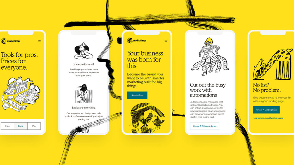
Key takeaway: a friendly identity is always a good idea
MailChimp teaches us that even in industries traditionally seen as serious or technical, there’s room to inject personality and humor into your brand.
10. Thursday
Dating app Thursday has distinguished itself with a brand identity that is bold, spontaneous and refreshingly direct.
Their visual identity is characterized by a vibrant purple color, an easily recognizable logo resembling a calendar page with a bold ‘T’ (for Thursday) and straightforward imagery. But what’s really cool is their copy. It’s daring, straightforward, and playful—perhaps how they want their users to be.

Key takeaway: your copy is one of your most vital brand elements
Their billboards are as daring as their online and offline campaigns. Thursday is all about connections, and the best way to do that is by putting yourself out there. They’re certainly setting an example.
11. Patagonia
Build the best product, cause no unnecessary harm, use business to inspire and implement solutions to the environmental crisis.
Patagonia Mission Statement
Outdoor apparel company Patagonia has a strong brand identity grounded in environmental activism and sustainable practices. Their minimalist logo of the Fitz Roy mountain skyline embodies the brand’s love for the outdoors and the planet in general.
It extends to their mission: “Build the best product, cause no unnecessary harm, use business to inspire and implement solutions to the environmental crisis.”
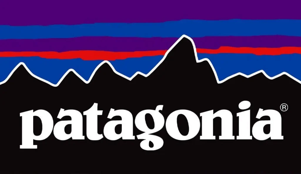
Key takeaway: make your mission your identity
This is a brand identity example that shows you can have a humble visual brand identity design but a strong mission, and still make it work. Their commitment to environmental preservation permeates every aspect of their business and makes communication easier than ever.
12. The Vegan Society
The Vegan Society has brilliantly built a brand identity that is perceived as reliable, inclusive, and informative.
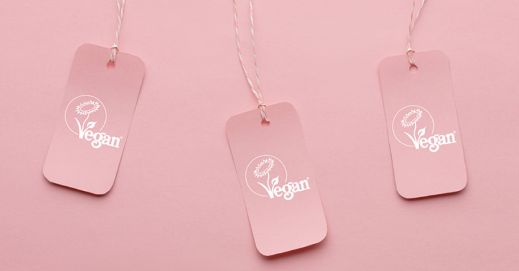
We sometimes get asked about the effect that the Trademark has on shoppers—for example, could it put non-vegans off purchasing a product? This research has shown that this is absolutely not the case—all kinds of shoppers recognize, trust, and actively seek out the Vegan Trademark.
This research has allowed us to gain some excellent leads and work with even more well-known brands. In turn, this increases our brand awareness, grows the business and charity, and helps us run even bigger campaigns. It’s a win-win situation!
Louisianna Waring, Senior Insight and Policy Officer at The Vegan Society
This is one of those brand identity examples that perfectly plays into who people want to be. Their website and social platforms are loaded with resources, ranging from vegan recipes to advocacy initiatives, all wrapped in a green-and-white visual theme that emphasizes health and vitality.
Key takeaway: make your identity about a lifestyle
Their consistent focus on education, advocacy, and the Vegan Trademark demonstrates the power of aligning brand identity with mission. For brands looking to gain trust and authority in their field, focusing on delivering value and maintaining consistency in your brand’s visual identity can go a long way.
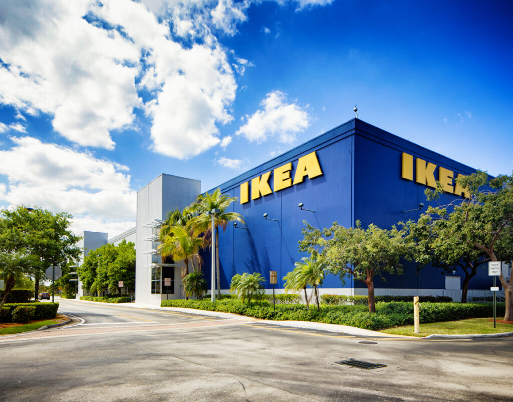
13. IKEA
You can walk into any IKEA, anywhere in the world, and know exactly where to find the pillowcases. The Swedish home furnishings giant has constructed a remarkable brand identity centered around easy-to-use design and has even implemented this in the layout of their stores.
Yes, the iconic blue and yellow logo stands out, but the brand is most known for its functionality, sustainability, and affordability. And the ridiculous product names.
Key takeaway: make your brand identity tangible
IKEA’s entire brand persona emphasizes the power of blending products, values, and customer experiences. From their DIY furniture to their stellar customer service, they make you feel like you’re in control and empowered–the type of friend we all need.
14. Glossier
It’s important to me that we’re building a company that emphasizes ‘beauty in real life.’
Emily Weiss, Founder of Glossier
Glossier’s identity is built around simplicity, authenticity, and customer engagement. Its soft pink aesthetic, clean packaging, and conversational tone create a brand that feels both premium and approachable.
By using user-generated content and a direct-to-consumer model, Glossier has built a strong sense of community and trust.
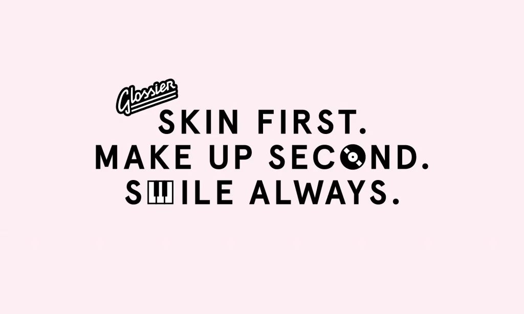
Key takeaway: A consistent, minimalist visual identity combined with community-driven marketing can create a powerful and relatable brand.
15. Notion
We want Notion to be the tool that molds to your way of thinking.
Ivan Zhao, Co-Founder of Notion
Notion’s brand identity reflects its product: flexible, modern, and highly customizable. Its black-and-white logo and clean UI design create a professional yet accessible feel. By positioning itself as the ultimate all-in-one workspace, Notion has built a brand that appeals to both individuals and teams.
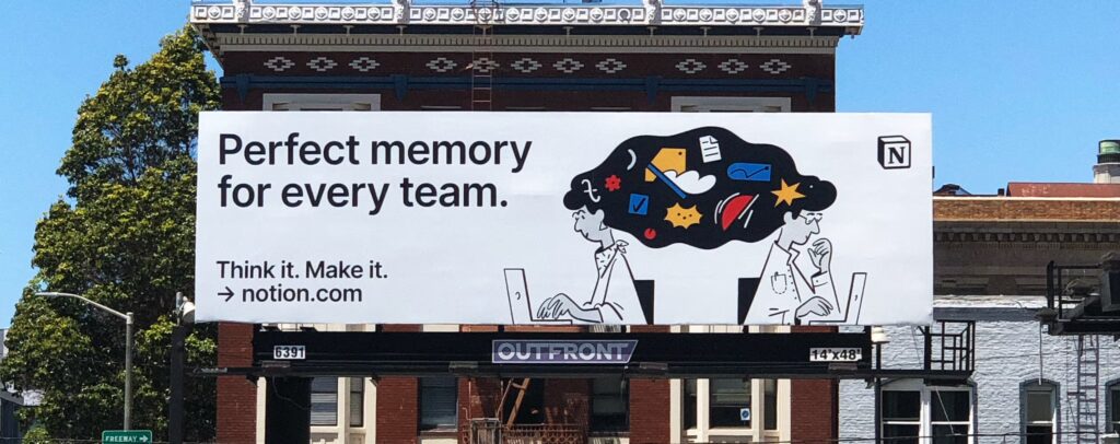
Key takeaway: A strong brand identity should mirror your product’s core value—simplicity and functionality in Notion’s case.
16. Monzo
We’re focused on building the best current account in the world.
Tom Blomfield, Co-Founder of Monzo
Monzo, the UK-based digital bank, has crafted a bold and modern identity that stands out in the financial sector. Its signature coral-colored debit card, friendly tone of voice, and focus on transparency make banking feel more accessible and customer-centric.
Key takeaway: Disruptive brands can build a strong identity by challenging industry norms and prioritizing customer trust.
17. Airbnb
Belonging has always been a fundamental driver of humankind.
Brian Chesky, Co-Founder of Airbnb
Airbnb’s brand identity is all about human connection. Its logo, known as the ‘Bélo,’ symbolizes belonging, while its visual storytelling focuses on experiences rather than transactions. By emphasizing inclusivity and cultural exchange, Airbnb has created a brand that feels warm and inviting.
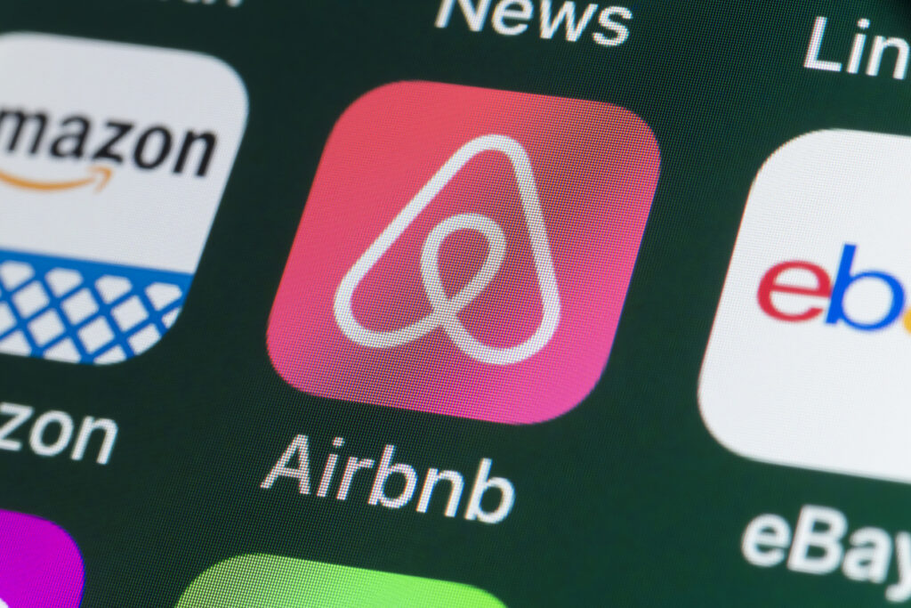
Key takeaway: A strong brand identity should tap into deeper emotions and values to build customer loyalty.
18. Ben & Jerry’s
We have a progressive, nonpartisan social mission that seeks to meet human needs and eliminate injustices.
Ben & Jerry’s Mission Statement
Ben & Jerry’s balances playfulness with purpose. Its hand-drawn packaging, vibrant colors, and quirky flavor names give the brand a fun personality, while its commitment to social justice and environmental issues adds authenticity.
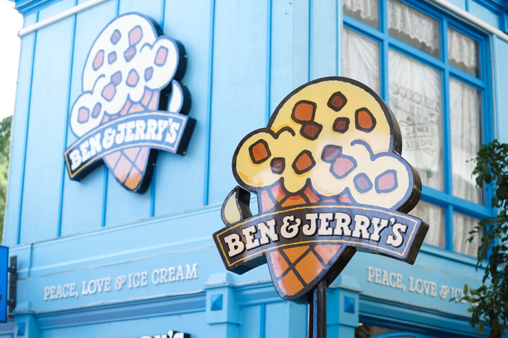
Key takeaway: A brand identity that blends fun with purpose can create strong emotional connections with consumers.
19. Spotify
We’re in the business of helping you find the right music for every moment.
Daniel Ek, Co-Founder of Spotify
Spotify’s identity revolves around personalization and discovery. Its vibrant, gradient-based color palette and bold typography create a youthful, energetic feel. Features like Wrapped and Discover Weekly reinforce Spotify’s identity as a brand that understands and adapts to individual users.

Key takeaway: A brand identity that adapts to user preferences can create a more personalized and engaging experience.
20. Oatly
We thought it was time to make it easy for people to eat better and live healthier lives without recklessly taxing the planet’s resources.
Toni Petersson, CEO of Oatly
Oatly has built a brand identity that’s playful, rebellious, and instantly recognizable. Its hand-drawn typography, witty packaging copy, and bold activism set it apart from traditional dairy alternatives. By using humor and a conversational tone, Oatly has cultivated a brand that feels both fun and purpose-driven.
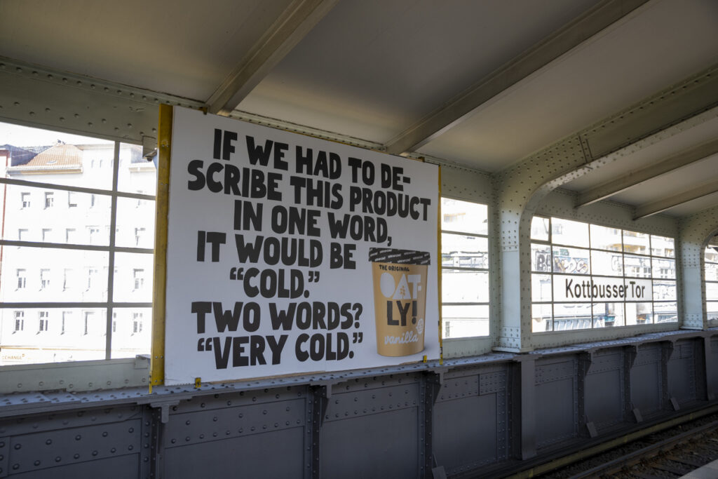
Key takeaway: A distinctive voice and bold messaging can help a brand stand out, especially in competitive markets.
How can you craft a strong brand identity?
Building a standout brand identity isn’t just about visuals. It’s about creating a consistent and memorable experience.
Here are some key steps to get your brand identity right:
- Evolve as your brand grows – Your identity should adapt over time while staying true to your core. Regularly check in to ensure it still resonates with your audience.
- Define your brand’s purpose and values – Start with the foundations: What do you stand for? What makes you different?
- Develop a unique visual identity – Your logo, color palette, typography, and design style should reflect your brand personality.
- Create a consistent brand voice – Establish how your brand sounds across marketing channels—formal, friendly, playful, or authoritative?
- Stay consistent across all touchpoints – From your website to social media and packaging, every interaction should reinforce your identity.
With our brand tracker, you’ll always know where you stand.

Develop your brand identity with Attest
Creating a brand identity is only the first step. To ensure its effectiveness and remain aligned with consumer expectations, you need to track its performance and adapt accordingly. Our brand tracker can help you do just that with ease. Understand how your audience perceives your brand, measure brand awareness, and track changes over time.
FAQ
A brand identity comprises the visible elements of a brand (such as color, design, and logo) that the consumer associates with it. It also entails things like a brand’s purpose and mission.
Developing a strong brand identity involves understanding your target audience, defining your brand vision and mission, crafting your brand’s visual elements, establishing your brand’s tone of voice, and creating a compelling tagline. Consumer research is a crucial part of this.
The ROI of a strong brand identity can be seen in increased customer loyalty, higher brand awareness, and improved overall brand perception, leading to an increase in sales and profitability.
The cost to build a brand identity varies greatly depending on the scope of the project and the chosen branding agency. It can range from a few thousand dollars for small businesses to hundreds of thousands for large corporations. For detailed pricing information, please visit our pricing page.