Creative packaging design has not always been associated with the food and beverage (F&B) industry. Packaging for fast-moving consumer goods (FMCG) can be a little, well, perfunctory. But when brands take the time to flesh out their creative food and beverage packaging ideas, their products really stand out from the crowd.
In this article, we’ve compiled 16 stand-out examples of brilliantly creative F&B packaging design across a range of categories—from snacks to takeaway food and beyond. We’ve also highlighted the importance of food packaging and how to get started collecting reliable data for your next food product development and packaging design project.
TL;DR
- Learn about the importance of food packaging, including need-to-know trends and how to gather actionable data.
- Find out why your packaging must stand out among competitors and draw the attention of consumers.
- Discover creative packaging designs for rice and pasta, fresh produce, soft drinks, dairy products, fast food, cereal, and more.
- Get started designing your own creative packaging with reliable consumer insights.
The importance of food packaging
In the crowded F&B market, packaging can be the difference between getting picked up or passed over. More than protecting a product, packaging also needs to capture consumers’ attention, communicate value, and influence purchase decisions.
For F&B brands, keeping up with packaging trends is key. Nowadays, brands must consider how:
- Sustainability is driving the use of biodegradable materials, reduced plastic, and refillable formats.
- Health and transparency are pushing brands to highlight clean ingredients, nutritional benefits, and certifications more clearly on-pack.
- Convenience is leading to resealable packaging, single-serve formats, and on-the-go designs.
- Premiumization shows up through minimalist aesthetics, elevated materials, and tactile finishes that signal higher quality.
- Digital integration—like QR codes or smart packaging—enables brands to extend the experience beyond the shelf with recipes, sourcing stories, or personalized content.
To align with these trends and ensure their packaging stands out, brands must ground their decisions in consumer insights. Testing packaging concepts with the right audience helps uncover what captures attention, communicates value clearly, and differentiates from competitors.
It also reduces the risk of costly redesigns by validating that visual cues, messaging, and format align with what consumers actually want—and what they’re willing to buy. Packaging can also reveal early signals of food and beverage product-market fit, especially when consumers understand the value, use case and reason to buy at first glance.
Using the right sample survey questions for a new food product can help teams collect clearer feedback on packaging appeal, perceived value, product expectations and likelihood to buy.
Creative packaging designs for rice and pasta
Rice packaging
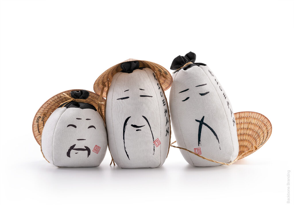
When Backbone Branding was asked by a small distributor to create a design for two types of rice, they wanted to explore the interesting journey the grain goes through before it arrives on our plates. In particular, they wanted to pay tribute to the humans in charge of the hard work in rice fields.
They chose sustainable sackcloth fabric to contain the rice, and a carton lid in the form of a traditional conic hat, which doubles up as a rice measurement cup. The faces on the bags display a range of facial expressions, so that the rice farmers appear to be conversing with one another when on the shelf.
Pasta packaging
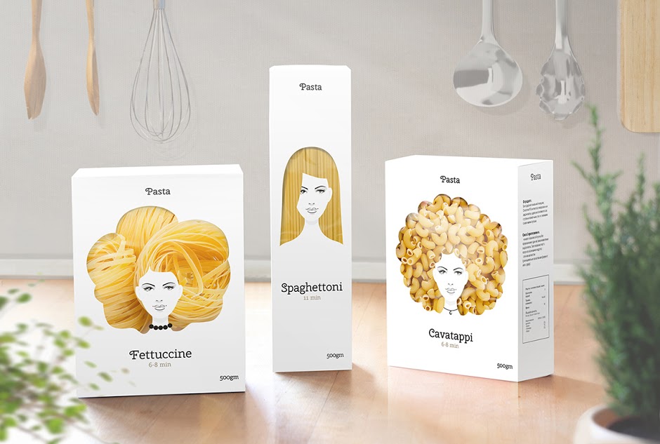
Moscow-based designer Nikita Konkin dreamed up this creative packaging design for pasta that makes the pasta inside look like hair. The pasta range includes fettuccine (the wavy one), spaghettoni (the straight one), and cavatappi (the curly one).
The designs are only mock-ups, but it shows how the design of the outer packaging can be combined with the product inside the box to create a two-dimensional, multi-textural image. By focusing the design on hair, it also challenges the idea that only food-based imagery can be used for food packaging design.
Creative packaging designs for fresh produce
Eggs packaging
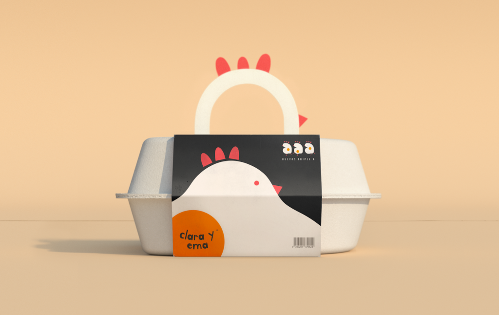
The egg box is a design staple that hasn’t been updated in… well, forever. Latin American design agency Creamos decided to change that by remodelling the carton in the image of a hen itself. The shapely carton is topped with a hen’s head handle.
The agency says it wanted to emulate the way eggs slip from the shell into the frying pan with its new “liquid” branding for Clara y Ema. This is even echoed in the free-form typography used on-pack.
Fresh meat packaging
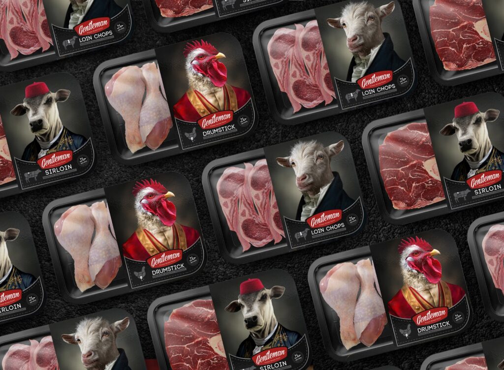
Iranian Studio Metis wanted to create packaging that better reflected the name of fresh meat brand Gentleman. Gentleman is one of the top livestock producers in the region and the idea was to show the quality of the produce by depicting the animals in ‘quality’ clothes.
The traditional style portraiture—usually reserved for aristocrats—is both eye-catching and amusing. At the same time it successfully conveys an air of prestige.
Creative packaging designs for soft drinks
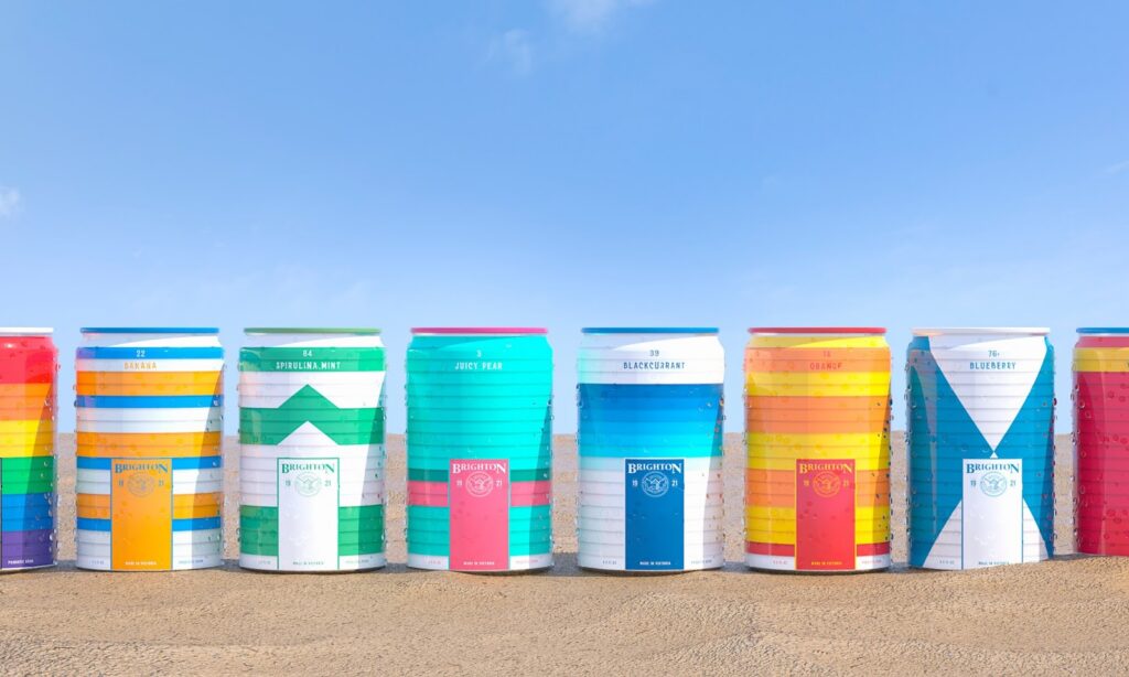
Seltzer packaging
No, they’re not beach huts. They’re cans of seltzer water! Created by Studio Blackthorns, these cans are inspired by real beach huts at Brighton Beach in Melbourne, Australia. Each of them has its own hut number and flavour (e.g., banana, spirulina mint, juicy pear, blackcurrant, violet & ginger).
They used the 1921 Brighton Life Saving Club logo to give the brand a more vintage look as well as a hand stencilled-style typography for the numbers and the flavours. Just looking at these cans transports you straight to the seaside, don’t you agree?
Soda packaging
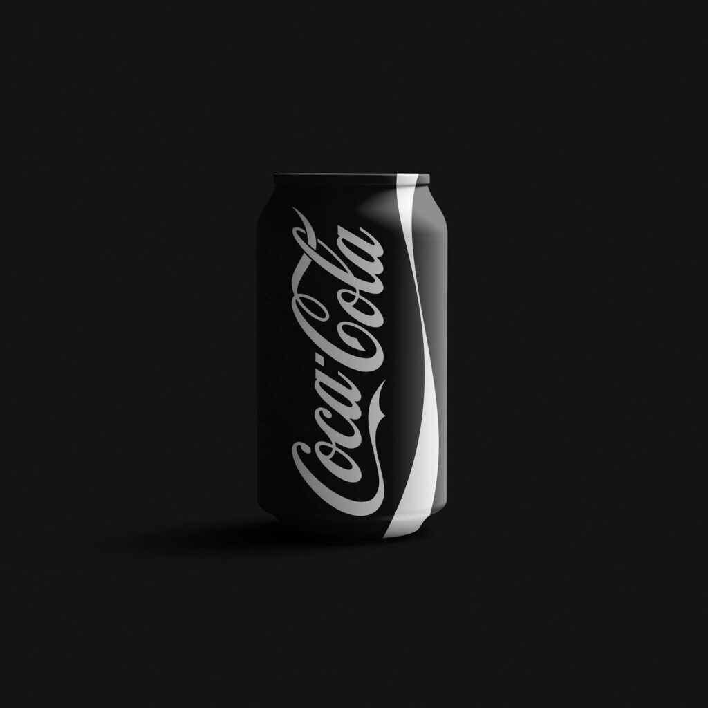
Spanish design agency Norte Branding undertook a rebranding against racism project in which they gave famous brands a chromatic makeover. Here we see Coca-Cola’s iconic red can re-done in black and white, demonstrating that the branding loses none of its power.
The message? Exterior colour doesn’t matter; what matters is on the inside. The agency also re-worked the packaging for Pepsi, Dr Pepper, Starbucks, Domino’s Pizza, and Kellogg’s Corn Flakes.
Creative packaging designs for dairy products
Milk packaging
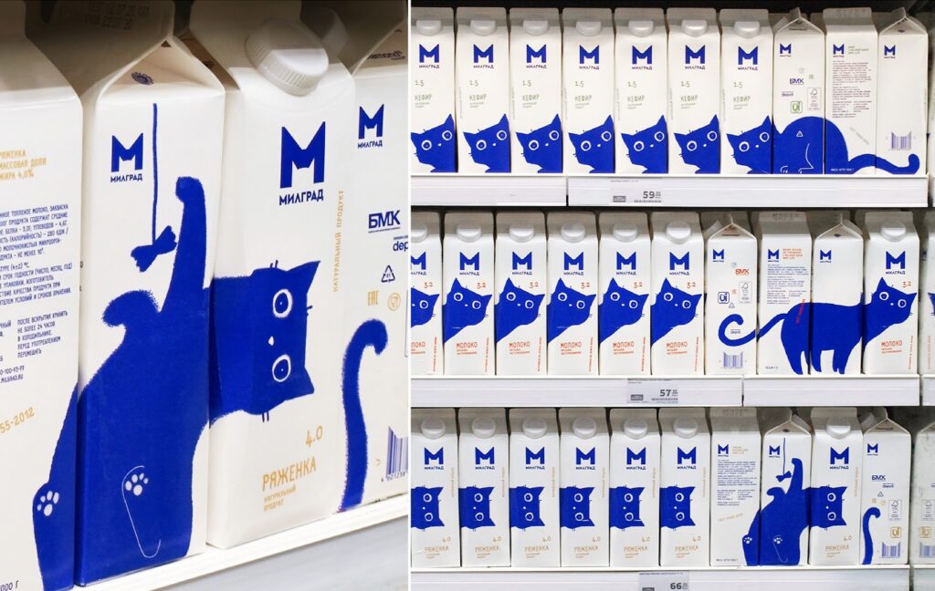
When it comes to milk, competition is high and it’s hard to stand out on the shelf. Depot branding agency decided to get shoppers’ attention with a playful cat design that turns the packaging into a toy.
The blue cat illustration is broken down into several designs, travelling across all four sides of the Milgrad milk carton. You can use the packaging like building blocks to create different pictures, making it irresistibly interactive.
Butter packaging
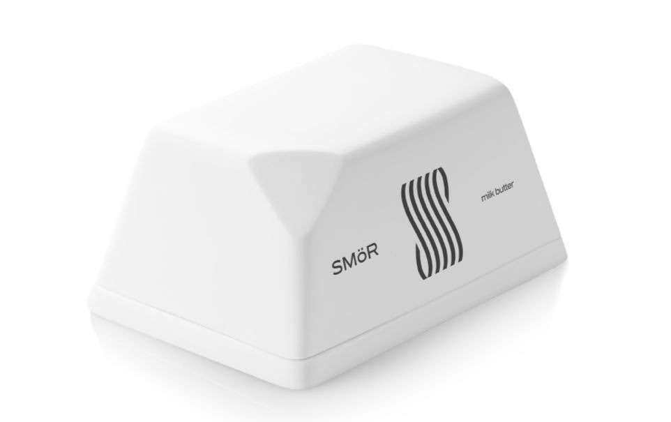
Mousegraphics of Greece also succeeded in differentiating a dairy brand in a visually overloaded market, but they did it in the opposite way—by stripping away design elements.
They were inspired by the brand’s name smör (which is the Swedish name for butter), creating a logo that transcribes the initial S to a visual reference to the rolling spires made by a knife on the butter surface. The packaging itself imitates a block of butter with a knob cut off.
Creative packaging designs for fast food
Burger packaging
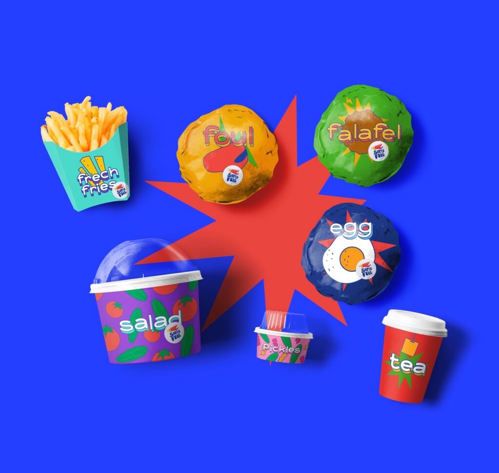
This colourful branding is bold by any standards but when you consider it was designed for the very traditional Egyptian market, it’s even more radical. The work is by Shiekh Branding for Egyptian restaurant Super Foul.
The aim was to attract a younger generation by making a distinct departure from the traditional colours, packaging, and art direction people are used to. This is why English wording was also chosen. Although the artwork feels like something entirely new, it’s reminiscent of the American 90s aesthetic, which is also making a comeback.
Pizza packaging
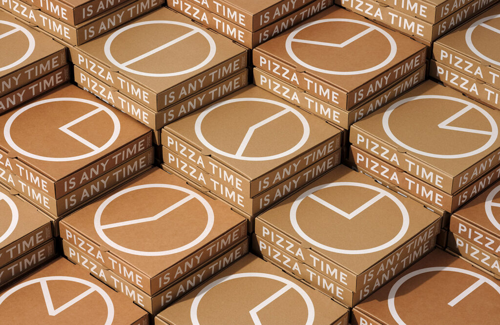
24-hour restaurant 7 West in Toronto, Canada, needed to solve a problem: promoting off-hours pizza orders to regular-hours customers. Man Wai Wong showed how creative package design could solve it.
The design agency created 12 boxes—one for every hour (AM or PM) to be used at the corresponding time. On the inside flap of each box were humorous reasons why that particular hour was a good time to order a pizza. For example, at 1 AM, you’re five hours into a Netflix binge.
Creative packaging designs for cereal
Cereal multipack packaging
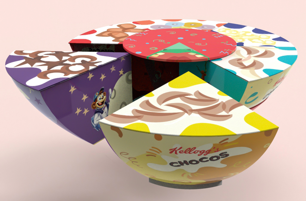
This is a student project by Shreya Pujari, re-imaging the packaging for Kellogg’s cereal 25g multipack. In India, the cereal is packaged in six plastic pouches contained in a plastic net. Pujari wanted to make it both more sustainable and more fun for kids.
She created six colourful card boxes shaped like slices of cake, held together by a card strip—all made from recycled materials. A disc at the top adds a spin-the-wheel feature to decide which cereal to eat. Each individual pack also has activities and fun facts to make it more interactive.
Creative packaging designs for food on the go
Salad packaging
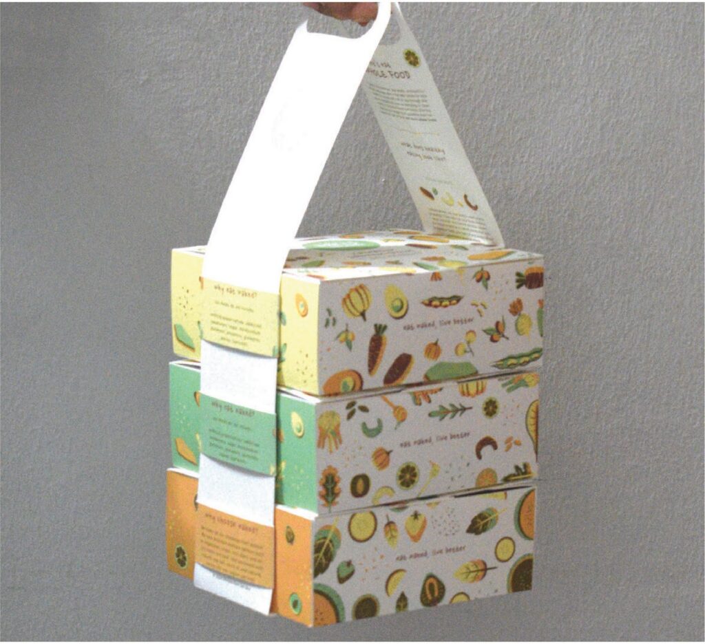
Food-on-the-go can get messy. Things move about in the bag, squashing and spilling their contents. Behance designer Denise Lau set out to solve this problem with her design for stackable meal boxes.
Multiple boxes can be easily and securely transported thanks to a carrying strap, which can be threaded through the sides of each box. Not only is it a better way to transport prepared food, but it’s also more sustainable, dispensing with the need for a carrier bag.
Takeaway drinks packaging
How’s this for creative food packaging? This machine squeezes fresh orange juice and uses the leftover orange peel to create a cup to drink it from. Created by Italian studio Carlo Ratti Associati, the prototype machine aims to bring circular design into everyday life.
Orange rinds are dried and milled to make “orange dust,” which is mixed with polylactic acid (PLA) to form a bioplastic material. This is then 3D-printed into a cup—a process that customers can watch. The cup can be recycled after use, with the material continually broken down and remade into further cups. How clever is that!
Creative packaging designs for alcoholic beverages
Wine packaging
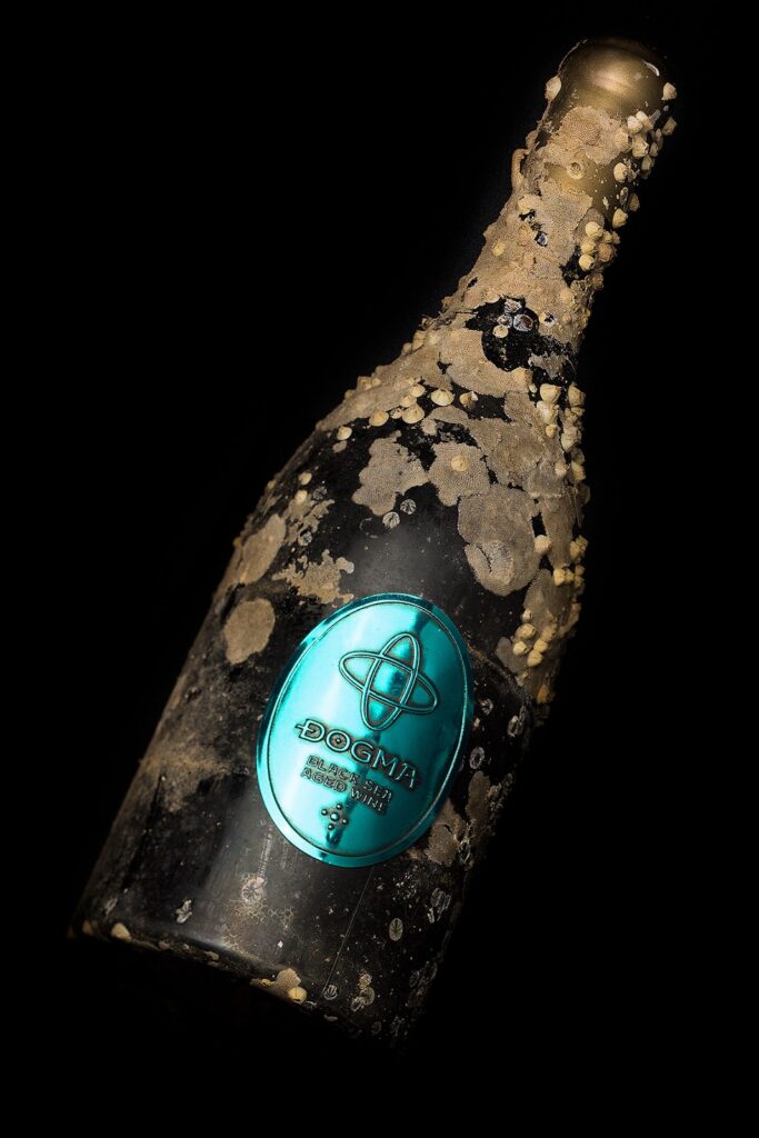
This certainly tops it when it comes to unusual packaging design. Bottles for Dogma Black Sea Aged Wines are submerged in the Bulgarian ocean for five months. Various sea creatures and organisms take up residence, resulting in a unique look for every bottle.
Design agency The Labelmaker enhanced the aged image with a premium embossed pewter label featuring a brushed patina effect. Meanwhile, the cork is covered in gold or silver wax all adding to the impression that the wine has been recovered from an old shipwreck.
Creative packaging designs for snacks
Nuts packaging
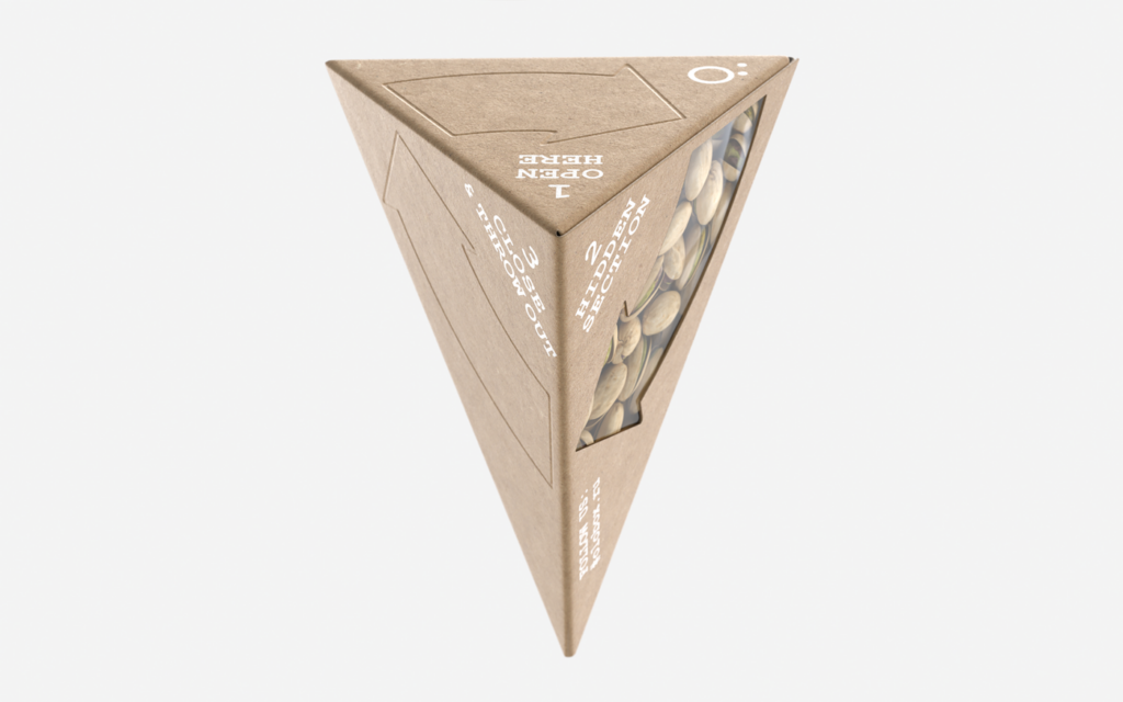
Food packaging really excels when form and function combine, like they do in this nuts packaging design. ÖLOBOX, created by Olkas Voron, is an innovative package with an integrated pocket for shells, allowing people to eat natural snacks anywhere.
Dried fruit and nuts packaging
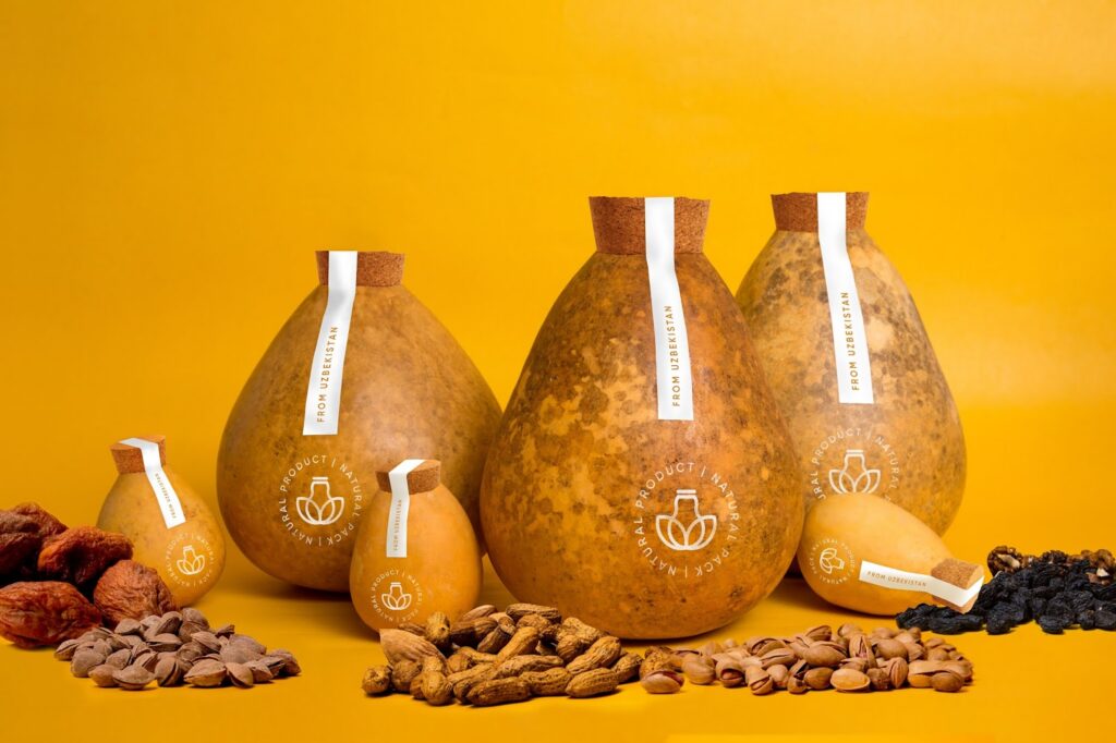
Looking for more nuts packaging ideas? Synthesis creative lab has shown how natural foods can be packaged in completely natural packaging. These beautiful cylinders are made from lagenaria, a plant from the gourd family.
Each one has a unique pattern and size, making them visually appealing and different from other types of packaging. Plus, the packaging is sustainable (it decomposes in one year) and practical (it’s waterproof, lightproof, and rigid).
Time to start work on your own creative packaging designs
To capture the attention—and appetites—of consumers, your F&B packaging has to be clever, creative, and aligned with evolving trends. Factors like sustainability, clear health benefits, and convenience all play a role in setting your product apart in a crowded landscape.
Before rolling out a new pack design, food and beverage product testing can help validate whether your packaging, claims and product experience are strong enough to drive purchase intent.
At Attest, we empower F&B brands like yours to make packaging design decisions that are grounded in real consumer data. With access to reliable insights from over 150+ million consumers across 59 countries, you can test your packaging ideas, refine your products, and gain a competitive edge.